
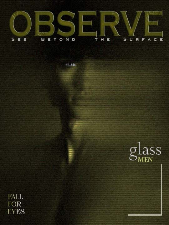
As a graphic designer, I’m drawn to designs that demand a second look. My latest piece — a bold yellow-themed composition with fractured glass textures and stark typography — is a rebellion against superficiality. Titled “Observe / See Beyond the Surface”, it merges the vibrancy of yellow with the fragility of glass to ask: What are we missing when we only glance?
Here’s how I crafted this piece in Photoshop, why color psychology matters, and how you can use contrast, symbolism, and intentional imperfection to provoke thought.
Decoding the Design Elements

1. The Psychology of Yellow
Yellow isn’t just bright — it’s unignorable. By saturating the background with a bold yellow hue (#FFD700), I aimed to:
- Grab attention instantly (like a “warning sign” for the mind).
- Contrast with the cool, muted glass textures, symbolizing the tension between surface allure and hidden depth.
Design Keywords: Color psychology, bold palettes, emotional contrast
2. Glass as a Narrative Tool
The cracked glass overlay isn’t just a texture — it’s a storytelling device. By using Photoshop’s displacement maps and *Multiply* blending modes, I created distortions that:
- Obscure parts of the text, forcing viewers to “dig” for meaning.
- Represent societal filters and the fragility of perceived truths.
Free Resource: Download my go-to glass texture pack [insert link].
3. Typography with Teeth
- “OBSERVE”: A heavy, industrial font (like Bebas Neue) shouts urgency.
- “See Beyond the Surface”: A delicate serif font (e.g., Playfair Display) whispers introspection.
The clash mirrors our struggle between reacting quickly and reflecting deeply.
Behind the Scenes: Photoshop Techniques
- Color Grading: Used *Curves* to intensify yellows and desaturate glass tones.
- Texture Blending: Layered glass PNGs with *Opacity* adjustments to create “peek-through” moments.
- Negative Space: Left intentional gaps in text to symbolize missing pieces of truth.
Pro Tip: Add a *Gaussian Noise* filter (3–5%) to glass layers for gritty realism.
Why This Design Resonates in 2024
We’re drowning in content but starved for meaning. As designers, we can either:
1. Contribute to the noise.
2. Create work that pauses the scroll.
This piece challenges viewers to interrogate their habits — both online and offline.
3 Lessons for Designers
1. Color Is a Character: Yellow isn’t just a shade — it’s a mood, a warning, a magnet. Use it deliberately.
2. Flaws Add Authenticity: Cracks in glass? Keep them. Perfect designs often feel sterile.
3. Typography Has Tone: Pair fonts like you’d pair wine and food — contrast, but harmonize.
Your Challenge: Design with Dualities
Create a piece that combines:
- A vibrant color (like yellow) with a cold texture (metal, glass, stone).
- A bold command vs. a subtle question.
Share it with #DesignDualities — I’ll showcase my favorites next month!
Struggling to balance aesthetics and meaning? Let’s chat! Comment your thoughts on using color as metaphor — or drop your own glass-textured designs👋
Color psychology in design, Photoshop texture blending, typography contrast, symbolic graphic design, visual storytelling techniques, minimalist design trends.